Why Apps Feel Addictive: The Psychology of Design
It's not your willpower. From variable rewards to the infinite scroll, persuasive design is engineered to keep you hooked. Here’s how to see it for what it is.

That Compulsive Urge to Scroll? It’s Not an Accident.
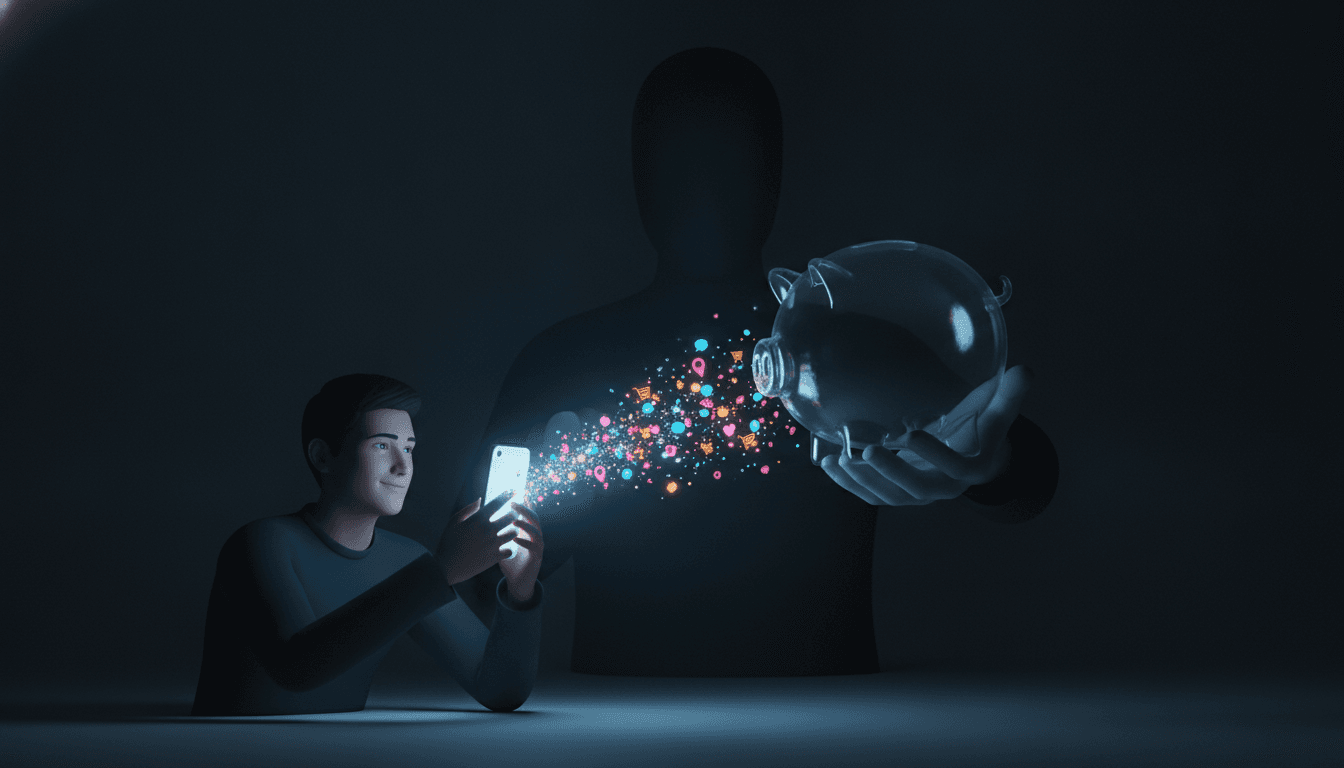
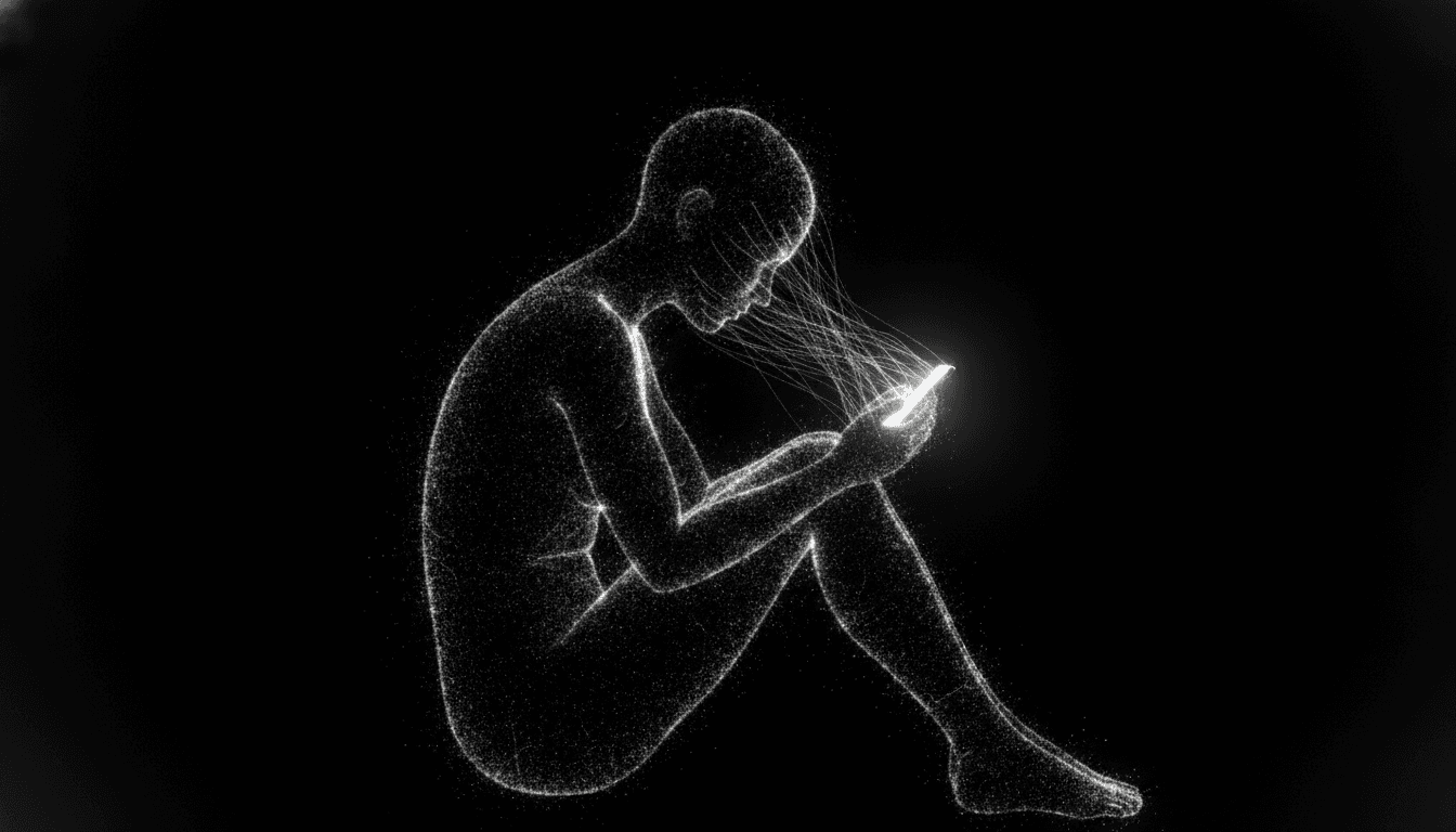
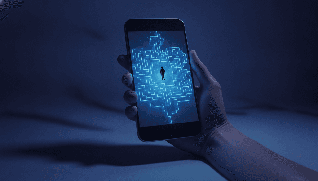
You grab your phone for one quick thing. A single task. Forty minutes later, you’re still there, swimming in a river of videos, updates, and notifications. Sound familiar? That experience isn't some personal failing or a lack of willpower. It is the calculated result of a system called persuasive design. Understanding the psychology of app design is the first step toward reclaiming your focus from a machine built to steal it.
The engine driving this is the dopamine loop. Dopamine, a neurotransmitter, spikes in our brains not when we get a reward, but in anticipation of one. It’s the same neural pathway that makes a slot machine so damn compelling. Apps leverage this with what behavioral scientists call a "variable reward schedule." You pull to refresh your feed. What will you get? A viral video? A message from a friend? Maybe nothing. It's the 'maybe' that keeps you pulling the lever. A 2022 study in PLOS ONE found that heavy social media users show changes in their dopamine circuitry that look disturbingly similar to those in people with substance use disorders.
The Architect of Habit: Meet the Hook Model
So how do they do it? Much of modern app design is built on a framework from author and behavioral economist Nir Eyal called the "Hook Model." It’s a dead-simple, four-step process designed to make you use a product without even thinking about it. An automatic response. The cycle works like this:
- Trigger: This is the cue. It starts on the outside, with an external trigger like a push notification. But the real goal is to get inside your head, creating an internal trigger where you turn to the app to escape boredom, loneliness, or stress.
- Action: The simplest possible behavior you can do for that reward. A mindless scroll. A double-tap 'like'.
- Variable Reward: The heart of the machine. The prize is unpredictable, which keeps you hunting for that next little dopamine hit from social media likes, new followers, or an endless stream of novel content.
- Investment: You put something into the app—your time, your data, a photo, a comment. This little bit of effort makes you value the product more, makes it harder to leave, and—here's the catch—loads the next trigger.
This model is exactly why your phone is so addictive. It’s a finely tuned machine for creating compulsive engagement. And in the attention economy, it’s your focus that’s being sold.
Persuasive Design Explained: The Tricks of the Trade
The Hook Model is the blueprint, but designers employ a whole toolkit of specific techniques to hold your attention. Once you see them, you can't unsee them.
Infinite Scroll & The End of Stopping Cues
The infinite scroll might be the most potent design choice of them all. Content used to have an end. You finished an article. You closed the magazine. The bottomless feed removes these natural stopping cues entirely. As former Google design ethicist Tristan Harris has pointed out, this is not an accident. It creates a frictionless experience that keeps you searching for the next reward without ever giving your brain a signal that it's time to move on. This can absolutely erode your ability to focus on longer tasks and even leave you in a funk after you finally put the phone down.
Streaks, Badges, and the Fear of Loss
Then there's gamification. Streaks. Badges. The language-learning app Duolingo is a master of this, using daily streaks to guilt you into consistent practice. These features tap into a psychological principle called loss aversion: we feel the pain of losing something much more powerfully than the pleasure of gaining it. Once you've built a 100-day streak, the thought of breaking it feels genuinely awful, compelling you to log in even when you don't feel like it. Your usage transforms from a choice into an obligation.
Push Notifications & Social Validation
Every buzz and ping from your phone is a carefully crafted interruption. A digital tap on the shoulder. Push notifications are classic external triggers designed to pull you back into an app, but many are engineered to leverage our deep-seated need for social approval. When someone tags you in a photo or likes your comment, that alert isn't just information. It's a hit of social validation. This creates a powerful feedback loop that makes you eager for the next alert—a core component of addictive design, as noted by the Deceptive Design project.
When Persuasion Becomes Deception: Dark Patterns Explained
Sometimes, persuasive design crosses a line into outright manipulation. These tactics are known as "dark patterns," a term coined back in 2010 by UX designer Harry Brignull. A dark pattern is a user interface crafted specifically to trick you into doing things you didn’t mean to, like signing up for a recurring subscription or making it incredibly difficult to cancel an account. They exploit our cognitive biases, assuming—correctly—that we'll scan pages rather than read them carefully.
You’ve seen these before:
- Roach Motel: It's easy to get into a situation (like a subscription) but almost impossible to get out of it.
- Confirmshaming: Guilt-tripping you into opting into something. The 'decline' button is worded to make you feel stupid, like "No thanks, I prefer to pay full price."
- Fake Urgency: Using countdown timers or bogus low-stock warnings to pressure you into making a quick purchase.
These deceptive practices benefit the business at your expense, and they have become so common that regulatory bodies like the Federal Trade Commission (FTC) have issued reports on their disturbing rise. Recognizing these patterns is crucial for navigating a digital world where your best interests are rarely the priority. For anyone feeling overwhelmed, exploring digital minimalism can be an empowering next step.
Taking Back Control
The answer to why apps are addictive lies in a sophisticated understanding of human psychology that's been weaponized to capture attention. These aren't tools waiting patiently for our command. Not at all. They are systems actively vying for our time and focus. But awareness is the antidote. By recognizing variable rewards, identifying the hook cycle, and spotting dark patterns, you can begin to see the architecture of persuasion all around you.
Simple steps can make a huge difference. Turn off non-essential notifications. Set app time limits. Try switching your screen to grayscale—it really does reduce the pull. This isn't about abandoning technology. It's about using it on your own terms. It’s about making damn sure that the tools you use serve your intentions, not the other way around.
Related Articles


This article was produced with AI assistance under human direction, and reviewed and fact-checked by a named editor before publication. How we work.
Frequently asked questions
- What makes an app addictive?
- Apps become addictive by leveraging psychological principles to create habits. Key techniques include 'variable rewards,' where unpredictable notifications and content trigger dopamine releases in the brain, similar to a slot machine. Features like infinite scroll remove natural stopping points, while gamification elements like streaks create a fear of loss that compels daily engagement.
- What is persuasive design in apps?
- Persuasive design is the practice of using psychological principles to influence user behavior. It's built into apps to encourage specific actions, such as increasing engagement, making purchases, or sharing content. Techniques include social proof (reviews, likes), scarcity (limited-time offers), and creating feedback loops that reward users for taking small actions, keeping them hooked.
- What is the 'Hook Model' for app design?
- The Hook Model, developed by Nir Eyal, is a four-step process for creating habit-forming products. It consists of a Trigger (a notification or an emotion), an Action (scrolling or tapping), a Variable Reward (an unpredictable and exciting piece of content), and an Investment (the user contributes time or data). This cycle is designed to bring users back repeatedly without external prompting.
- What are dark patterns in app design?
- Dark patterns are deceptive user interface (UI) design choices that trick users into actions they didn't intend to take. Coined by UX designer Harry Brignull, examples include making it extremely difficult to cancel a subscription, using confusing language to trick users into accepting certain settings, or shaming them for declining an offer. They prioritize business goals over the user's best interests.
- How can I reduce my phone addiction?
- You can regain control by consciously countering persuasive design. Start by turning off all non-essential push notifications. Set daily time limits for problematic apps using your phone's digital wellbeing tools. Another effective trick is to set your screen to grayscale, which makes the colorful, reward-based interface less stimulating and appealing to your brain.
Sources & further reading
Sources
- getmotivated.ai — getmotivated.ai
- cyberjustice.blog — cyberjustice.blog
- medium.com — medium.com
- londonpsychologistclinic.co.uk — londonpsychologistclinic.co.uk
- uxdesigninstitute.com — uxdesigninstitute.com
- medium.com — ravidudilusha.medium.com